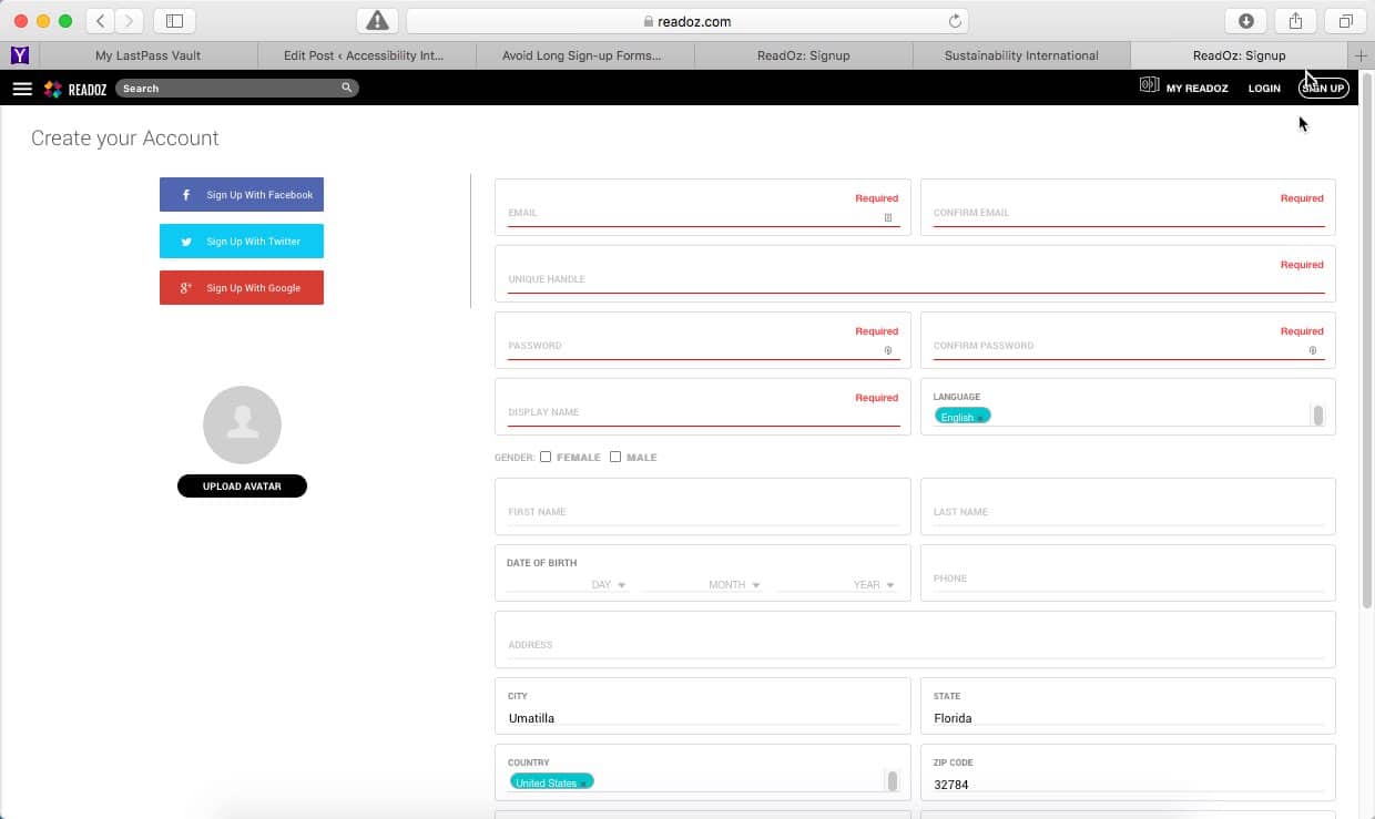
Long Registration Forms are Deal Breakers
Anything you require your visitors to do, creates a barrier between you and them. What happens when you encounter a lengthy sign-up form with lots of questions. Either you ignored it and clicked away or you entered bogus data.
Registration forms are not fun because people have to invest their time and effort to register. Then they have to remember their user name and password.

Readoz’s registration form is lengthy, with a large number of questions to be answered to complete the form. Many of the questions are unnecessary and are not required to complete the form. The number of questions required is numerous and beyond the information necessary.
You have to make your sign-up form as short as possible. All you really need from your registration’s is to be able to identify each user. You need a unique identifier, such as a user name or email address, and a password. If you don’t need more information, don’t ask for it. Keep your form short.

Tumblr’s Form is Only 3 Questions
A great example of a shorter registration form, Tumblr’s form is one of the shortest sign-up forms around. It has just three fields, asking for a visitor’s email, password and user name.
Tumblr get’s it, they understand how much more effective a short form is.

Basecamp’s Form Has Only 1 Question
The Basecamp sign-up page is short, asking for the minimum information possible. They engage their visitor, including answers to FAQ’s immediately below their form.
Doing this removes visitor’s distractions and helps keep them focused on the form. Basecamp removes all your objections making your sign-up the logical result.
Usability is Supposed to Make Things Easier
Usability is all about making things easier to use. Requiring less thinking by your visitors, resulting in less frustration. Your website should do all the work and present visitors only with the things they’re looking for.
Usability is About Your User Exprerience
Usability is also about the experience people have using your website, so attention to detail matters, as do the presentation and feel of the page.


