Long Registration Forms are Barriers
Registration forms are barriers for your visitors. They are barriers because it requires time and effort by your visitor to complete them. On top of that, the task itself is no fun.
People have to invest time and effort to register. Then they have to invest even more time and effort in the future to remember their user name and password.
You can minimize this barrier by making your sign-up form as short as possible. This works for you because the purpose of a registration form is simply to be able to identify each user.
The only requirement that is crucial is to collect a unique identifier for each visitor. This can be as simple as a user name or email address and a password. If you don’t need more information, why ask for it. Keep your form short. More visitors will be willing to complete a short form and you accomplish your goal with less pain.

Why Include Optional Fields?
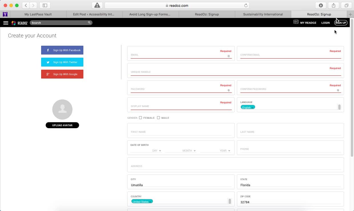
The ReadOz sign-up form is very long, asking for too much information. When you examine the form, you discover that only a few of the fields are required. Many of the fields are optional.
If fields are optional, they don’t really need to be there. A long form like this would likely scare off a user seeing it for the first time. Show only what the person needs to register; the rest of the information can be gathered later.

Tumblr’s Form has Just 3 Questions
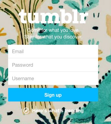
Tumblr has one of the shortest sign-up forms around. Just three fields: email, password and your chosen username. Tumblr embraces the principles of both usability and accessibility.

Basecamp’s Form is Shortest of All
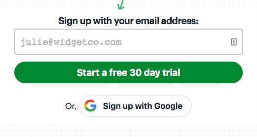
The Basecamp sign-up page adopts a common practice. It’s a simple form which keeps the user focused on the sign-up process. A list of frequently asked questions are designed to remove all objections as visitors are guided down their sales funnel. There is nothing to distract them or means of leaving the page.
Usability Makes Things Easier
Usability is all about making things easier to use. Requiring less thinking by your visitors, resulting in less frustration. Your website should do all the work and present visitors only with the things they’re looking for.
Usability is About User Experience
Usability is also about the experience people have using your website, so attention to detail matters, as do the presentation and feel of the page.


