Make Your Content Accessible with Site Searches
Having site search allows a person to bypass the structure and content of a site and go directly to the content they desire. The site search feature should be easy to find and simple to operate. An advanced search form could be provided, but it should not be the default option. The search form should be easily found, and have a clearly labeled search text box and/or button.
Your site search feature is most usable if it appears on every page, though that is not required. It should appear on the home page, without forcing users to click a link to reach a search page. The search feature should have a character width of about 25 to 35 characters, so users can type and edit their queries easily.
Site search can be marked up with the “search” ARIA landmark role, <form role=”search”> to make it more easily accessed by screen reader and keyboard users. This role differentiates the search form from all other forms on the page.
What Does Web Accessibility Mean to the Disabled?
Most of us are familiar with how Accessibility applies to physical business places. However, little thought has been given to how Accessibility applies to the Internet. Accessibility on the World Wide Web demands that we break down barriers and open a clear path for everyone.
This means that web pages must be designed so that those with Visual, Hearing, Motor and Cognitive disabilities have an equal opportunity to navigate and access every web page.
Site Maps or Site Indexes Promote Accessibility
There are three main types of site maps or indexes:
- Alphabetical Indexes
- Structural Indexes
- Graphical Indexes
Alphabetical Site Indexes Enhance Accessibility
Alphabetical site indexes list all of the important areas of content on a site in alphabetical order, much like the index at the back of a book. This may be unnecessary for small sites. It may be impractical for very large sites, because these lists can become too lengthy to use effectively. However it is also one of the most useful ways for a user to find information on the majority of sites.
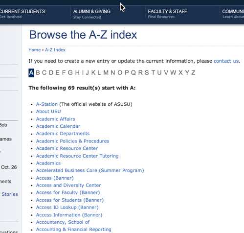
Well-designed alphabetical site indexes include synonyms of words and concepts that users may want to search for. For example, in a site about classical composers, alphabetical site indexes should account for the fact that users may try to find out information about the composer Claude Debussy by looking under the first name, last name, or even terms such as “French composers,” “impressionistic music,” or even the names of his compositions such as Claire de Lune or Reverie. The example below cross-references terminology about web technologies.
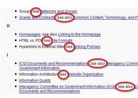
The more comprehensive your alphabetical index, the more useful it is. For large sites, developers may need to create multiple pages for long indexes, perhaps providing a page for each letter of the alphabet.
Structural or Topical Site Indexes
A structural site map is a list of links to the contents of a web site, organized by topic or category.
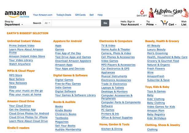
Most structural site maps mirror your site’s organization. For example, if a site has 3 main “tabs,” or category links at the top of each page, these 3 categories could be your method to organize the content of the structural site map. Generally, your site map organization should reflect some navigation or structural organization of the site.
Graphical Site Maps Bring Accessibility
Graphical site maps are an alternative to the more common text-based versions. These graphics may look similar to the organizational charts often used by businesses to delineate their hierarchical relationships of employees. Below is a screenshot of a graphical structural site map of a fictional company:
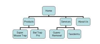
The above example is simplistic, but the idea would be the same for more complex sites. However, one problem with graphical site maps for complex sites is that they would need large structural maps. Perhaps larger than could be easily understood.
There are many ways of representing a site’s organization graphically. Photos or graphics could be used in the headings to group and illustrate concepts. Circles or boxes could be drawn around related pages.
A furniture store could use a floor plan of a house to organize the names or photos of different types of furniture. All of the links to kitchen items could literally be placed in the diagram’s kitchen, and so on. This type of concept can be quite powerful when carefully used and tested for usability. The creativity involved in can easily backfire, resulting in a confusing mess. Be creative, but test solutions to ensure they work.
Graphical site maps are usually unnecessary if the visual design of the site navigation provides obvious visual cues to the structure of the entire site. Another primary issue is screen reader accessibility. It would be unfeasible and unusable for such a graphical site map image to be given adequately descriptive alternative text. If used, other mechanisms for providing access to the site structure may be necessary.
