Many people do understand the need to provide visitors to their website with alternative text to ensure that they enjoy the same experience as those without disabilities. However this is not the sole purpose for providing alternative text. Additional accessibility principles must also be addressed when dealing with the various types of images which may be used on websites.
Images Enhance Our Comprehension
Some wrongly assume that images are bad for accessibility. When an image is present, the webpage replaces the image with a text-only version of that image for text readers. Logically we would then assume that text-only sites are ideal for accessibility.
The hole in this logic, is that it is assuming that there is only one type of disability, visual disabilities. Most other users benefit greatly from the presence of images while screen reader users are presented with alternative text to give them a full experience.
Illustrations Require Alternative Text
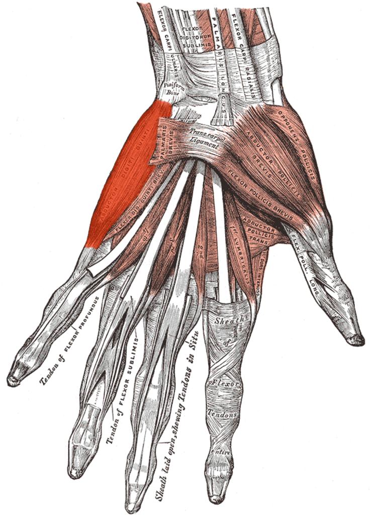
Many ideas can only effectively be presented with the addition of illustrations, maps, and charts. It’s hard to imagine how difficult it would be to learn human anatomy from a book with no illustrations. Would that be an effective method to learn human anatomy? Below is an example of an annotated illustration of the human hand that might appear in an anatomy textbook
.

You will probably find it hard to imagine that a text description alone could be as understandable as text supplemented by illustrations. In this case, a picture is worth 10,000 words, at least. Illustrations, maps, charts, etc. can enhance comprehension, especially for those with learning disabilities or reading disorders.
Color and Contrast
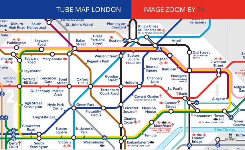
Just like text, color must not be used as the sole means of conveying meaning or content. What does it mean to convey meaning with color alone within images? Let’s take a look at this map of the London Underground:

A person who can see colors will have no trouble distinguishing between the red line, the dark blue line, the light blue line, and so on. A person who cannot see color well, due to color-blindness or low vision, will probably not be able to distinguish the different routes as easily.
Remember, some users may override your page colors to a high contrast color combination they require. Someone who is blind will not be able to see them at all. What happens if you take the colors away from this image?
When color is removed, the map becomes almost unusable. Test your web pages to ensure that none of the meaning is lost when you remove the colors, even within images. You can do this by printing out the page on a black and white printer, making sure that your printing preferences are set to print background colors. There are also tools, such as Vischeck, which will remove all page color or that will simulate color-blindness.
In addition to color reliance, images that convey text must present that text with sufficient contrast. Text contrast within images is particularly important if the image is of low quality or when the image is enlarged.
WCAG 2.0 sets minimal contrast thresholds for text and images of text. Testing of contrast values within images can be more difficult (there is typically not a defined RGB color value to easily access), but common sense can usually tell you if an image has insufficient contrast.
Make Your Icons Accessible
Web applications often use icons to supplement or replace the text. Complex content and functions, such as clicking the home icon in a browser to go to your home page, can easily be conveyed through a very small icon.
Icons should be simple, and they need to be easily understood. Icons almost always require familiarity in order to be useful. You have to be careful because across cultures and languages, icons may misinterpreted quite easily.
If you use icons, ensure that the icons are well designed, easy-to-understand, and used consistently. In many cases, text may be necessary instead in addition to unclear or potentially ambiguous icons.
Make Your Animations Accessible
Animations are rarely used to enhance the accessibility of web content. Most of the time they are simply annoying and distracting. Banner ads often animate to distract us from the main purpose of a web page.
Well designed animations can, however, can enhance content by presenting media content or by focusing attention on important content. An animated graphic may present a sequence of images that convey content that cannot adequately be presented to one static image.
Highlighting or other animations can focus the user on important information, such as error messages or required inputs. Animation should almost always be user controlled or very short in duration.
Images that continually animate can cause the rest of the page to be more difficult to navigate and comprehend. For users with very high levels of distractibility, animations may make a page totally inaccessible to some users.
WCAG 2.0 Success Criterion 2.2.2 (Level A) requires that automatically moving, blinking, or scrolling content that lasts longer than 5 seconds can be paused, stopped, or hidden by the user.
Avoid Image Pixelation if Possible
Some users with low vision use programs that enlarge the elements on their screen so that they can more easily see them. When images are enlarged, they can become pixelated and more difficult to read.
So does this mean you shouldn’t use text in your graphics? Not necessarily, though true text should be used when practicable.
WCAG 2.0 Success Criterion 1.4.5 (Level AA) requires that if the same visual presentation can be made using text alone, an image should not used to present that text. There are many benefits to using true text instead of images. However, the primary reason is that true text can enlarged without pixelization or degradation of the image quality. It should be noted that logos are exempt from the WCAG requirement.
Fortunately, modern browsers do a much better job of enlarging graphical content than in the past. With the increased use of CSS, it is easier to style true text to achieve the desired visual presentation. Consider the readability of text within an image, and if possible, use text instead.
Avoid Graphics That Cause Seizures
Bright, strobing images or media can cause photo-epileptic seizures in some users. These seizures can be dangerous, even life-threatening to some. Practice proper universal design techniques. You don’t want to be responsible for any of your users to having seizures induced by your content.
In order to potentially cause a seizure by users with photo-sensitive epilepsy, a flashing image or multimedia must:
- Flash more than 3 times per second (note that Section 508 specifies 2 times per second).
- Be sufficiently large. A very small flashing image, such as a cursor, will not cause a seizure.
- There must be significant contrast between the flashes
The color red is also more likely to cause a seizure. While large, flashing images are not commonplace on the web, seizure-inducing media is often present. Web video, especially HD-quality video that includes strobing special effects is becoming more common. You should avoid using this type of media.
WCAG 2.0 Success Criterion 2.3.1 (Level A) provides thresholds for frequency, size, contrast, and color of strobing images.
What Does Web Accessibility Mean to the Disabled?
Most of us are familiar with how Accessibility applies to physical business places. Little thought has been given to how Accessibility applies to the Internet. Accessibility on the World Wide Web demands that we break down barriers and open a clear path for everyone.
This means that your web pages must de designed so that those with Visual, Hearing, Motor and Cognitive disabilities have an equal opportunity to navigate and access every web page. Web Accessibility for all is more than just a catchphrase, it’s the right thing to do.


