An accessible PDF is one that all users can open and read, even those using assistive technology such as screen readers or connected Braille displays. As organizations are learning more and more about how to ensure their online content is compliant with digital accessibility legislation and reaches everyone, tagging PDF documents also needs to be addressed.
PDFs are often not accessible
PDFs are one of the most flexible and secure document types. Many organizations use these documents both internally and on their websites to store important information that they need to share with employees, customers, and partners. Unfortunately, often PDFs do not interact properly with assistive technology. Most people get information from PDFs visually on their screens, but assistive technology provides information that it detects digitally, not visually. That means that what many people see on their screen when opening a PDF document isn’t always what a person using assistive technology is provided by their screen reader reading aloud, or in Braille provided by their connected Braille display.
Tags
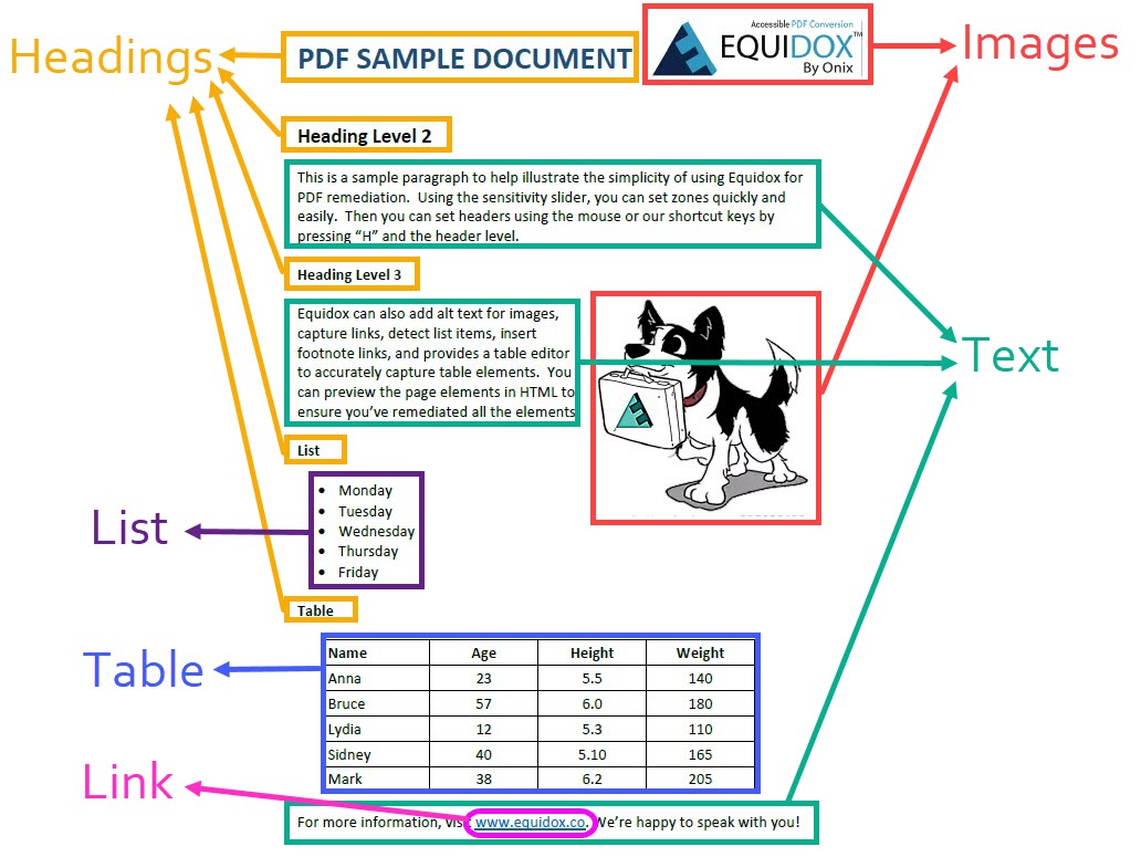
In order to convey the information that most people obtain visually from a PDF file, assistive technology relies on digital labels, called “tags,” to get the information the file contains. These digital labels tell the user what is in the document, and help the screen readers and Braille displays to navigate the document. Digital tags address elements such as text, headings, links, images, lists, tables, and the reading order of those elements. The diagram below shows a “map” of digital tags for a simple document. It contains each of these elements, some of them appearing multiple times.
Text
The most common element of a PDF file is simple text. Most text is arranged in paragraphs, and usually read top-to-bottom, left-to-right just like any book page. Assigning a tag to text tells the screen reader or Braille display to read the content word for word. This is the most basic of digital tags used to tag PDF files.
Headings
Headings are the equivalent of newspaper headlines. They provide information about what is contained in the document and make it easier to find specific pieces of information in a large document. Visually, a person will use the cues of font size and weight (bold or larger fonts) to identify headings. They can visually skim through the pages of a document and pick out sections they wish to read fully based on the headings they see throughout the document. A person using assistive technology cannot visually identify those headings by font or weight, so they require a heading tag to allow them to navigate the document quickly. Assistive technology can be set to just read items with heading tags, which effectively allows the user to skim the document just like someone who is reading the document visually.
The headings should not simply be labeled 1, 2, 3, 4, 5, etc. as if they were a simple list of the contents. The heading structure should be hierarchical, with only a single heading level one per document (usually the title) and various levels of headings under that heading level one, in an outline format. Headings that indicate information that is a subset of other content should have its headings set to the next level.
A good example of correct heading structure is illustrated by looking at books by JRR Tolkien. Books by JRR Tolkein would be Heading level 1. The Hobbit, The Lord of the Rings, and the Simarillion would be heading level 2, as a subset of books by JRR Tolkien. The Fellowship of the Ring, the Two Towers, and The Return of the King would be heading level 3, a subset of the Lord of the Rings series. Books I and II of the Fellowship of the Rings would be heading level 4, each chapter would be heading level 5, and so on.
- Books by JRR Tolkien
- The Hobbit
- The Lord of the Rings
- The Fellowship of the Ring
- Book I
- Chapter 1
- Chapter 2…
- Book II
- Book I
- The Two Towers
- The Return of the King
- The Fellowship of the Ring
- The Simarillion
Links
Links must be tagged as such, especially if they are embedded in the text of the PDF. They should be embedded with descriptive text that explains where the link is going. A correct example is “Equidox website.” The text describes the destination of the link, instead of spelling out the entire URL. This is useful for all users, not just assistive technology users. Labels such as “click here” are not considered descriptive as they do not contain an explanation of the destination. Additionally, without a digital tag, the link may not be actionable, meaning that assistive technology users can’t actually use the link to go to the destination page.
Images
Images should also have specific digital tags. These tags need to also contain text alternatives (alt-text) explaining what the image portrays. Alt-text is a tag added specifically for assistive technology and will not be seen or read by people who are only using the PDF visually.
It’s important to understand whether the image is purely decorative or is being included to convey information, and what that information is. Purely decorative images (like background wallpapers, decorative shapes or icons, or repetitive logos in a multi-page document) can be marked as “artifact,” which means they don’t need to be read by assistive technology. Such images should NOT be read as they convey no added meaning and will be disruptive to an assistive technology user. For example, no one needs to hear “Your College’s logo” on every single page when reading college course materials.
When writing alt-text, the context must be considered. Is the image of children at a table intended to illustrate their clothes? Their classroom? A cafeteria? Their diversity? What does the text say and how does the image contribute? Consider these questions when writing alt text.
Additionally, graphs, charts, maps, and diagrams also require alt text. Many charts and graphs can be adequately described by referring to the data table from which they are derived if it is included. “Chart based on previous data table” is sufficient if the data is provided. If not, the image must be described in detail and convey the information fully to the assistive technology user. Take care to fully convey the information being shown when describing maps or diagrams. Find more detail on writing alt-text in this article.
Lists
Another type of element for tagging PDFs is lists. Lists must have a digital tag that explains both that the items make up a list, and what the parent and child items of that list are. Some lists can be very simple with just a series of items. Others need to be hierarchical, similar to the heading structure. Lists require the entire list to be labeled, as well as each item, and how it relates to the rest of the items in the list. This process quickly becomes very complex. Parent and child items of nested lists need to be clearly tagged in order to convey the relationships properly. Building tags for nested lists can quickly become very complex and needs to be undertaken with care.
Tables
Tables are another complex element that need to be carefully tagged to convey their full meaning to someone using assistive technology. When a table is read visually, it’s very easy to understand that each cell relates to its applicable column and rows. However, when using assistive technology, each cell has to be tagged with not just its value, but also it’s relation to the columns and rows of the table. As an assistive technology user uses keystrokes to move from one cell to another, they need to be told exactly what row and column headings apply to the cell data being read. They need to understand when the structure of the table changes in order to understand the complex data being shared. Merged cells can further confuse things, as they have to be carefully defined. Assistive technology users also need a table summary added to the table tags, to explain how the table is arranged and where any merged cells are.
Reading Order
One of the most troublesome issues with PDF documents is how the reading order is defined. Without corrective tagging, reading order can be presented to assistive technology wildly inaccurately. For example, often when a document is created, content is added, subtracted, and moved during the editing process. Digital tags created in the source document (an MS word file or Google doc) that will eventually be saved as a PDF file frequently don’t end up in the correct order after conversion. Edits to a source file can cause the resulting PDF file to present content out of order, based on when each element was added to the document.
Content arrangement can also cause issues with reading order. Most documents read from left to right and top to bottom. Documents with multiple columns that are read this way will make no sense. Assistive technology reads text from the top of each column left to right, rather than reading each column top to the bottom of the page before proceeding to the next column, unless the content is properly tagged in the correct reading order. Inserting images and other elements like tables and lists into the text, or even overlapping the text, can cause further confusion unless the reading order is correctly set. These digital tags must be ordered to allow assistive technology users to proceed logically through the content.
Load up your toolbox!
 If you think tagging PDFs sounds complex, you are not alone. Fortunately, there are some tools available that vastly simplify this process. Equidox PDF remediation software is designed for novice or professional remediators. It can make some of the more complex processes such as tagging lists and tables and setting reading order incredibly fast and easy. Watch it in action by viewing some of our videos.
For more information on tagging PDFs as well as how easy Equidox software can make your remediation job, please visit our Equidox PDF Academy.
The post How to tag PDFs for assistive technology appeared first on Equidox.


