

While I focus on websites in my work, thanks to Deque University I’ve been learning about applying accessibility principles to other types of content.
While many documents are distributed online as PDFs, making an accessible PDF is tricky because you need to have a copy of Adobe Acrobat to ensure it is marked up as accessible.
Making an accessible Word document is often the starting point for making an accessible PDF. Word is also cheaper and more commonly available than Acrobat.
So I thought I’d recap some of the main things I’ve learned about Word accessibility into an accessible Word document checklist. Many of the principles of making accessible web pages apply to Word documents as well.
Here’s what I’ll cover:
- Document language
- Font choice and size
- Large print
- Page numbers
- Writing style
- Headings
- Links
- Text formatting
- Symbols and special characters
- Images
- Colour and contrast
- Tables
- Help from Microsoft to make accessible Word documents
Document language
Your document language in Word should be set to the language of your operating system. To check, go to File > Options > Language tab and then view the Office Display Language section. If it isn’t your primary language, change it.
Setting the correct document language: who does this help?
If the language isn’t set correctly, the pronunciation will sound wrong when the document is read out by a screen reader.
Font choice and size
Compare the text below, taken from Bram Stoker’s Dracula in two different fonts.
Which version can you read faster?
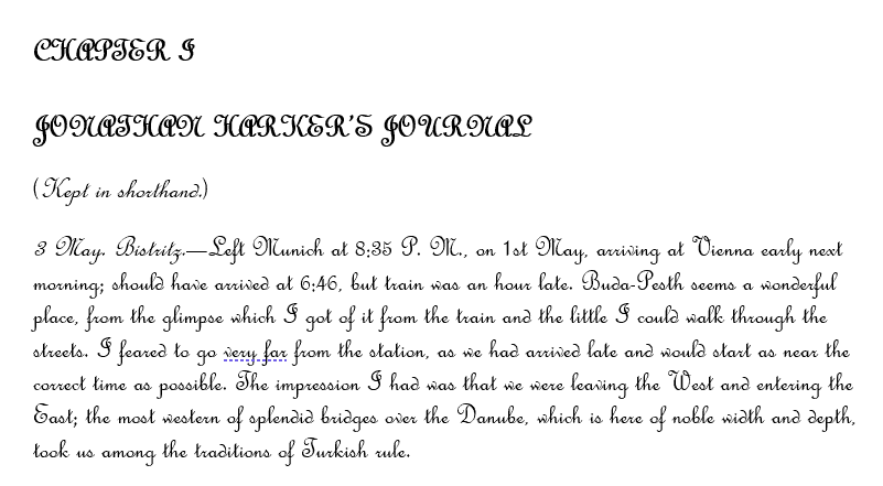
I expect you found the second passage easier to read! The capitalized text using the script font is exceptionally difficult to make out. The simpler font is much more legible.
Make sure your body font size is big enough. Text under 10 points is not recommended. While users can zoom in on a document, not everyone knows how, and if you distribute a printed copy of the document, some people won’t be able to read it.
Choosing a legible font and font size: who does this help?
Everyone, but particularly low vision users.
Large print
To format a large print document, make the font size of the body text 16 to 18 point.
A single column layout is better for large print documents.
The UK Association for Accessible Formats (UKAAF) have advice on creating accessible large print documents.
Large print: who does this help?
People with a visual impairment who have difficulty reading regular print.
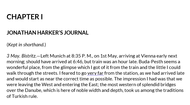
Page numbers
Include page numbers if your document has multiple pages. You can do this by going to Insert > Page Number. Select the top or bottom of the page to enter them, and the numbering style.
Page numbers: who does this help?
Everyone. Page numbers are especially useful if your readers are printing a document.
Writing style
Keep your writing simple and clear. Don’t write long sentences with complex words or jargon, as your writing will be harder to understand.
There are some good tips on writing content on the UK Government Digital Service website. While this article applies to web pages, most of the advice applies to Word documents too.
The Editor tool (see below) can offer help to improve your writing style.
Clear writing: who does this help?
Everyone – particularly people with a cognitive disability.
Headings for sections and subsections make documents easier to understand.
Make headings by selecting text and choosing a heading level from the Styles panel.
The Outline View in Word shows you the view of your document by heading.
Another bonus of using headings is that you can use them to generate a Table of Contents for your document. The Table of Contents option is available under the References tab.
Headings: Who do they help?
When a document has headings, it’s easier to scan. Headings are particularly valuable for screen reader users because they can use them to navigate quickly between sections of the document, like hyperlinks.
A Table of Contents helps everyone, though they are best used when the document is longer.
It’s easy to add links to your text. Select the text you want and click Link in the Insert section.

Then enter the URL in the Address box and click OK.
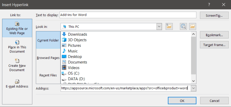
Give some indication of where the link goes in your link text. “Add-ins for Word” is better link text than “here”.
Good hyperlinks: who does this help?
Everyone can benefit from links, but URL links aren’t as helpful for people using screen readers as text links, because they may not be able to tell from the URL what the link is for. The link https://isc.ro isn’t as obvious as Internet Scrabble Club.
If someone may be likely to print your document, though, you might choose to add the URL in brackets after the link. (If you type or paste a URL directly into your document and then press the space bar, your link will be automatically formatted as a link.) In this case, there will be some duplication for screen reader users.
Text formatting
Most text formatting is ignored by screen readers. That includes bold, italic, strikethrough, highlight, subscript and superscript. So don’t rely on them for meaning.
If a piece of text is important, you could alert the user to it by prefacing it with the word Important.
Try not to use ALL CAPITALS – they are harder to read and come across as shouting!
Don’t use the underline tool. Underlined text could be mistaken for a link.
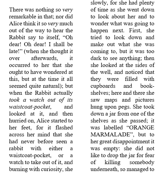
Avoid using justified text, as the gaps between words can cause the words to “swim” on the page. The effect is more marked when the text is in columns, as in the example below.
Thoughtful text formatting: who does this help?
You can help screen reader users by mentioning important words in the text rather than indicating them by formatting.
Not using justified text helps your dyslexic readers.
Symbols and special characters
Special characters aren’t reliably read out by screen readers, with a few exceptions such as &, @, £, $ and ½. Writing symbols longhand is more reliable.
Also, some symbols aren’t as easily understood as their text equivalents. Using the word “and” is clearer than using an ampersand (&).
One thing I discovered when testing was that a screen reader reads the greater than symbol (>) as “gt”.
Using special characters sparingly: who does this help?
Screen reader users and people with a cognitive disability.
Images
Alt text
The good news for your blind readers is that you can label images with alternative text in Word, as you can for web pages.
When you enter an image, right-click on it and select Edit Alt Text to open up the alt text pane and enter your alt text. Microsoft have a useful online article about writing good alt text.
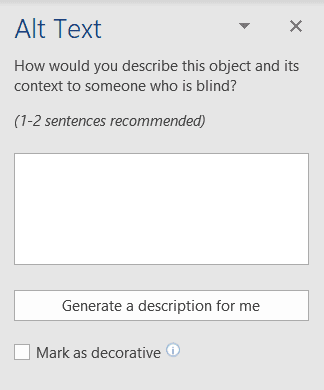
Word has an automatic alt text feature, too. If it’s turned on, it auto-generates the alt text for you.
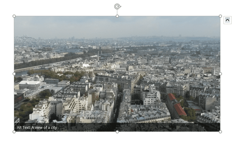
The automatic alt text for the image above is “A view of a city”, which is generic. Because I know the context of the photograph, I could relabel it as “A view of Paris from the Eiffel Tower”.
Decorative images
What if your image is decorative? You might have spotted the Mark as decorative checkbox in the alt text pane which should do the job. This is meant to replicate an image with null alt text on a web page.
Unfortunately, screen readers are inconsistent in how they handle images marked as decorative.
I tested a Word document with two screen readers, JAWS 2020 and NVDA 2020.1.
My document had 4 different test conditions for images:
- Image with alt text
- Image with no alt text
- Image marked as decorative in Word
- Image has a single blank space as alt text
Here’s a video with the results:
I was expecting that neither screen reader would mention the decorative image. But that’s not what happened.
Instead, JAWS read the image as “graphic, decorative”.
NVDA fared worse. It read the image marked as decorative the same as an image with no alt text: “graphic style Normal”.
I found this WebAIM discussion on the topic of decorative images in Word interesting. It notes that another problem with the “mark image as decorative” feature is that it isn’t backwards compatible with older versions of Word.
However, if you make a PDF from a document with decorative images, those images are converted to artifacts in the PDF, and are subsequently ignored by screen readers.
Floating images
Another problem with Word document images is when they “float”. Images can float if they are not set to show In Line With Text and instead have some form of text wrap. Floating images aren’t accessible to screen readers, even if they have alternative text.
Sometimes Word inserts images or other objects for you with text wrapping already on. The Accessibility Checker (see later on in this article) will help you spot this problem.

The Sparkle heart image has text wrap In Front of Text, so the alt text isn’t read
You may have to make a trade-off: design aesthetics versus accessibility.

The first image is inline with the text. The second image wraps with the text, which looks more visually pleasing, but is less accessible.
Image alt text: who does this help?
Labelling images with alternative text and making sure that they sit in line with text benefits anyone using a screen reader with Word.
Colour and contrast
It’s good practice to follow the same advice as the Web Content Accessibility Guidelines for colour contrast, which specifies a contrast ratio between foreground and background of:
- 4.5:1 for normal text
- 3:1 for large text (18pt normal text, or 14pt bold text)
The Accessibility Checker, which I mention later, can help you tell if the colour contrast in your document is sufficient.
Good colour contrast: who does this help?
Good colour contrast benefits:
- anyone with a form of colour blindness
- older people, who have less light reaching their eyes with age
- anyone reading in bright light conditions, which reduce contrast
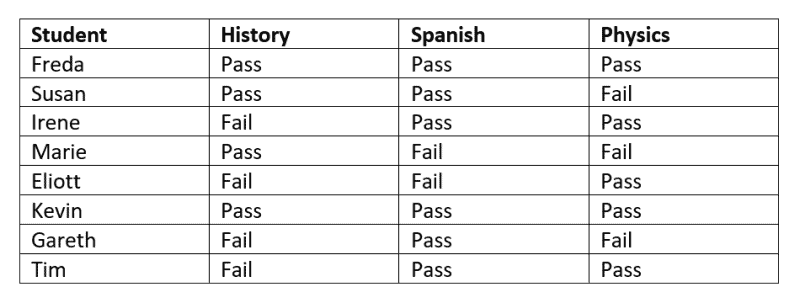
Tables
You are best creating tables for data, not layout.
Use Insert > Table > Insert Table to make an accessible table. The Draw Table option doesn’t create a table in the same way, and it makes it less accessible.
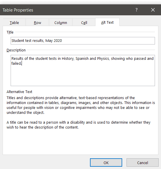
Use table headers (using Insert Table should automatically add these). Give your table a title, and optional description.
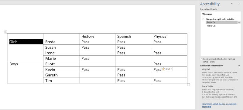
Simple tables are best. Screen readers don’t cope well with split or merged cells, or tables nested within other tables.
Who does this help?
Screen reader users benefit most from proper table creation and labelling.
Help from Microsoft to make accessible Word documents
Microsoft are fairly committed to accessibility. They have some in-built tools in the cloud version of Office to make your files more accessible.
Editor
The Editor is an updated spelling and grammar checker. Use the Editor button in the Review tab to check how readable your writing is.
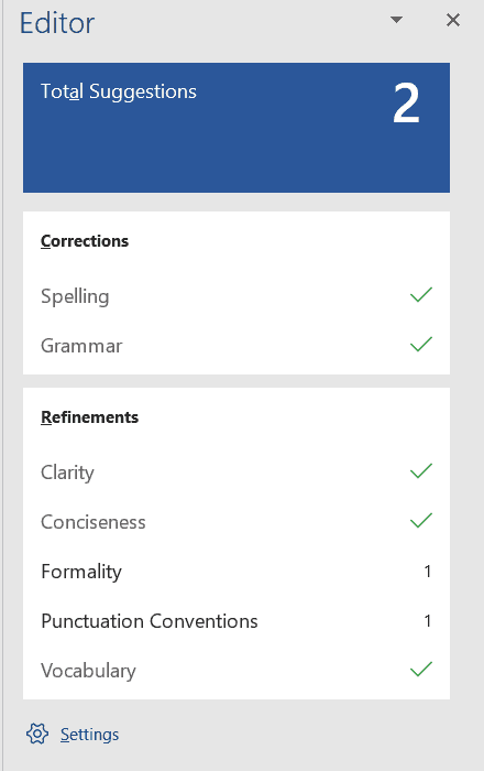
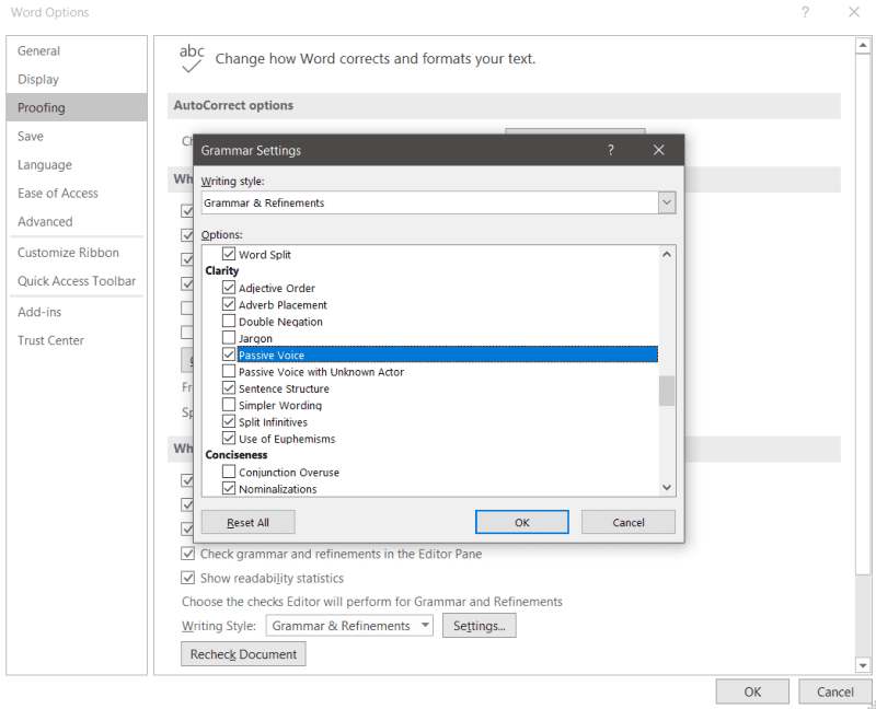
Clicking on the cog icon at the bottom of the Editor pane lets you adjust the settings. By checking more checkboxes you can get further tips on your writing, for example when you use the passive voice. (Using the passive voice isn’t bad in itself, but overuse may make your content boring to read!)
Accessibility Checker
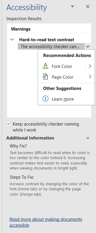
The Accessibility Checker built into Office can check for a few accessibility violations, and you can set it to run while you work. Find it under Check Accessibility in the Review tab.
Some of the checks it can make in Word are:
- Alt text is present for an image, and it doesn’t contain a filename or file extension.
- Images or objects are in line with the text.
- Tables have a simple structure – no nesting, split or merged cells.
- Colour contrast between the text and background is sufficient.
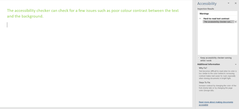
As well as showing what’s wrong, and why, the checker will suggest fixes.
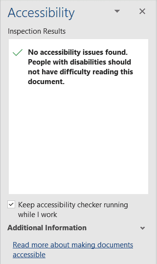
If you see a tick on the inspection results, congratulations – but be aware that there could still be accessibility issues you need to spot manually.
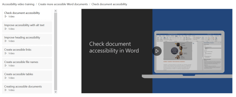
Watch Microsoft’s Word accessibility videos
Microsoft have a series of videos about making more accessible content. Seven of them apply to Word accessibility. They’re definitely worth a watch as they will show you practical steps you can take.
The topics covered are:
- Check document accessibility
- Improve accessibility with alt text
- Improve heading accessibility
- Create accessible links
- Create accessible file names
- Create accessible tables
- Creating accessible documents
Over to you
Is there anything important I’ve missed in this accessible Word document checklist? Please let me know in the comments.