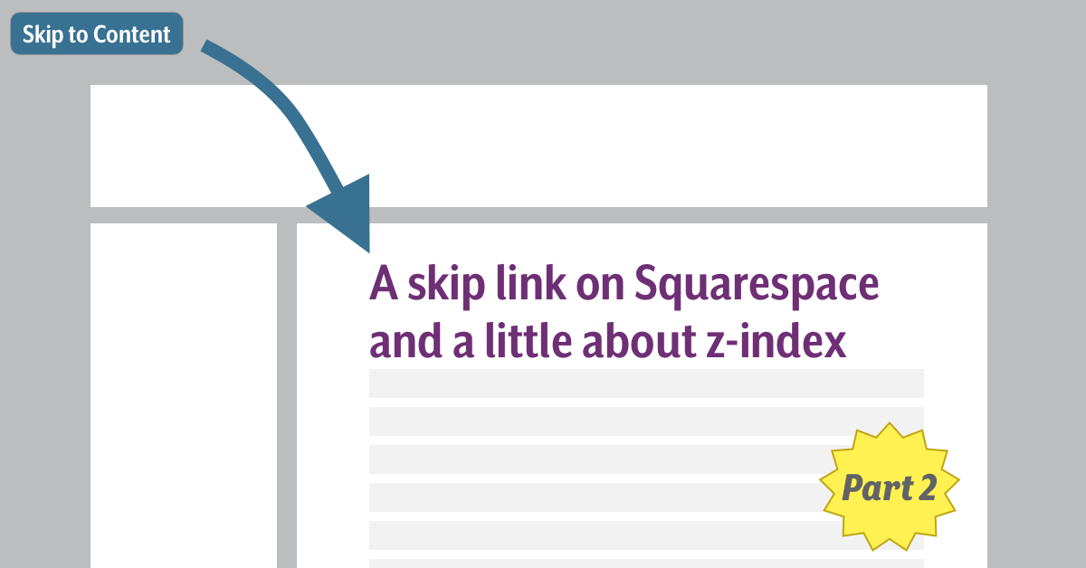
As a reminder, a skip link is a link at the top of a web page (i.e. first in the tab order) that allows a user to bypass all the links that precede the main content on the page, e.g. navigation links. Typically, a skip link is hidden until it receives focus, and will be hidden again when focus is removed from the link. Skip links are useful for users that do not rely on a mouse to navigate a web page.
Drawbacks
As the skip link is not officially supported by Squarespace, this isn’t a perfect solution. We did not test this with all Squarespace templates or in every environment, and as Squarespace points out, changes to the CSS could potentially affect how the template works and break functionality. We saw it working on our site, but test it in different browsers and devices (e.g. mobile) to make sure the skip link does not interfere with the responsive design or other features of other templates.
Tab Order
For the most part, this solution follows the tab order just as a traditional skip link would. If you activate the link, it will take you to the main heading and the tab order will resume from there, and pressing tab again will direct focus to the first link after the main heading.
If the user were to press shift+tab, the expected behavior would be to go to the link that immediately precedes the main heading. But here the focus goes back to the skip link. It appears as if the tab focus is jumping back to the top of the page. It is not clear to me why this happens.
If the user tabs forward from the main heading and then tabs back the skip link is not activated, and the tab focus jumps back to the navigation. It only happens when focus is moved to the heading that this change in the tab order can be observed. I added a tabindex value of -1 to the heading to track how focus moves around and you can see this on this new version of the skip link page on Squarespace.
z-index
Another issue we encountered was the z-index of different elements in the template’s positioned elements. Before this project, I had a very basic understanding of z-index. I knew that it corresponded to the stacking of elements relating to the viewport and that elements with a higher z-index would be “closer” to the user. After implementing the skip link, I learned that I had completely misunderstood how z-index functions and a quick aside about z-index will be useful.
If we imagine a coordinate plane where the x and y coordinates relate to vertical and horizontal positioning, the z coordinate will relate to depth. The z-index is the placement of a positioned element on this third plane. I am specifically calling out that the elements are “positioned” because the z-index only applies to elements that have a position value of absolute, relative, fixed or sticky.
Furthermore, each positioned element’s children are stacked relative to the parent. This means if a positioned element called element 1 has a z-index of 3 and its sibling called element 2 has a z-index of 4, no child element of element 1 will ever be positioned in front of element 2 or any of its children.
This is apparent in Squarespace with our skip link in two ways:
The z-index of the navigation elements in the header <div> is greater than the z-index of the <div> element that contains the body content. In fact, it appears that the <div> element containing the body content is not even positioned in its own “stacking context“, and so it will always sit behind any element in the same “stacking context” that is a positioned element, like the header <div>.
This means that the navigation elements will always sit on top of our skip link, which impacts the readability and the functionality of the link. For the template we used, the header <div> is transparent, permitting the skip link to be visible behind it. Nonetheless, it is easy to imagine an instance where the header <div> is opaque, which would hide the skip link from view.
Also, if the skip link position and the navigation elements’ position overlap, then the text of the navigation links will appear on top of the skip link. In our page, we placed the link out of the way of the navigation as best we could, but there could very well be screen sizes or zoom levels that do cause some overlap. We did not find this, but that does not mean it is impossible.
This z-index conflict also made the skip link inaccessible to mouse users, i.e. it is not clickable. Since the header div sits on top of the skip link, the skip link is never actually exposed to the hover of the pointer. The header <div> is transparent so it presents the illusion that we are hovering over the skip link, but the mouse is actually registering that it is placed over the elements in the header div.
As the skip link is predominantly a convenience for keyboard users, we accepted this limitation. A mouse user is less likely to ever see the link, and if they do, they can simply navigate to the main content with the mouse, making the skip link redundant for these users. It is certainly not a perfect situation, but one that we judged preferable to going without a skip link at all.
The impact this style has on the appearance of a website, its functionality, and the discord between what is seen and what is read by screen readers was difficult to unravel. To help myself better understand z-index, I created a small web page to play with different stacking contexts and the z-index attributes and hope it might be useful to others. I would also recommend reading this page with a screen reader to see how z-index hides content from view while exposing it to assistive technology.
There are also many useful resources online to help understand how z-index works. Here is a short list of items that helped me:
- Using
z-indexandz-indexCSS property (MDN web docs) - The Z-Index CSS Property: A Comprehensive Look (Louis Lazaris, Smashing Magazine)
- “What no one told you about z-index” (Phillip Walton)
Screen Readers
The final consideration to make is the impact on screen readers. For screen reader users, this can present content that is not visible on screen, and does not quite match the logical order presented visually. If read straight through from the navigation links, a screen reader will read the text of the skip link before it reads the heading while the skip link is positioned off the page. The true position of the skip link anchor precedes the <h1> in the main body of the page so that when a screen reader arrives at this element in the natural flow of the document order it will read it.
We experimented with hiding the skip link using aria-hidden="true" but that causes the link to not have an accessible name. (As the link is in the main content landmark, that landmark is announced.)
We decided to leave the skip link exposed because, while the announcement of the skip link is odd, it does not interfere with the flow of the content in the main content and appears at a moment of transition between the navigation links and the main content. In our calculations this was preferable to hiding content from a user because it did not significantly interfere with the presentation of the primary content.
Conclusion
These blog posts are not meant to be a criticism of Squarespace or anyone who chooses to use Squarespace to create a website. Accessibility issues can be found in almost any web environment regardless of the platform, as we can see from WebAIM’s most recent review of 1,000,000 websites.
The skip link was not the only imperfect solution we had to implement to overcome limitations with Squarespace, or to address the needs of the client. Understanding that there are constraints and working within those limitations was an invaluable lesson. I can’t imagine being successful at addressing these limitations without a collaborative, supportive, and open team. We were all free to experiment and make suggestions and discuss the pros and cons of various solutions in a safe environment.
Without that spirit, I would not have proposed this “hacky” skip link proposition to the group or approached the project with the enthusiasm that threw me head long into z-space. The team we had and the environment we created was as valuable as our collective technical skills and knowledge to improving the accessibility of our client’s site.
Since its inception in 1998, AIR has given more than 2,000 volunteers like Derek the chance to improve their knowledge of digital accessibility and inclusive design. More than 450 nonprofits, charities, schools and artists have received accessible websites and gained awareness about digital inclusion. Accessible websites allow for everyone, including people with disabilities, to access online content and become more socially and economically integrated into our digital world.
Registration for AIR 2020’s competition is now open! Web developers and designers from anywhere around the world can join!


