Injecting accessibility features into existing websites can be a challenge. During Knowbility’s 2019 Accessibility Internet Rally (AIR), I was part of Indy Team 7. Our client had a site on Squarespace which we needed to make more accessible. While working on our client’s site, we found many barriers to improve the accessibility of the site and searched hard to find ways around these barriers.
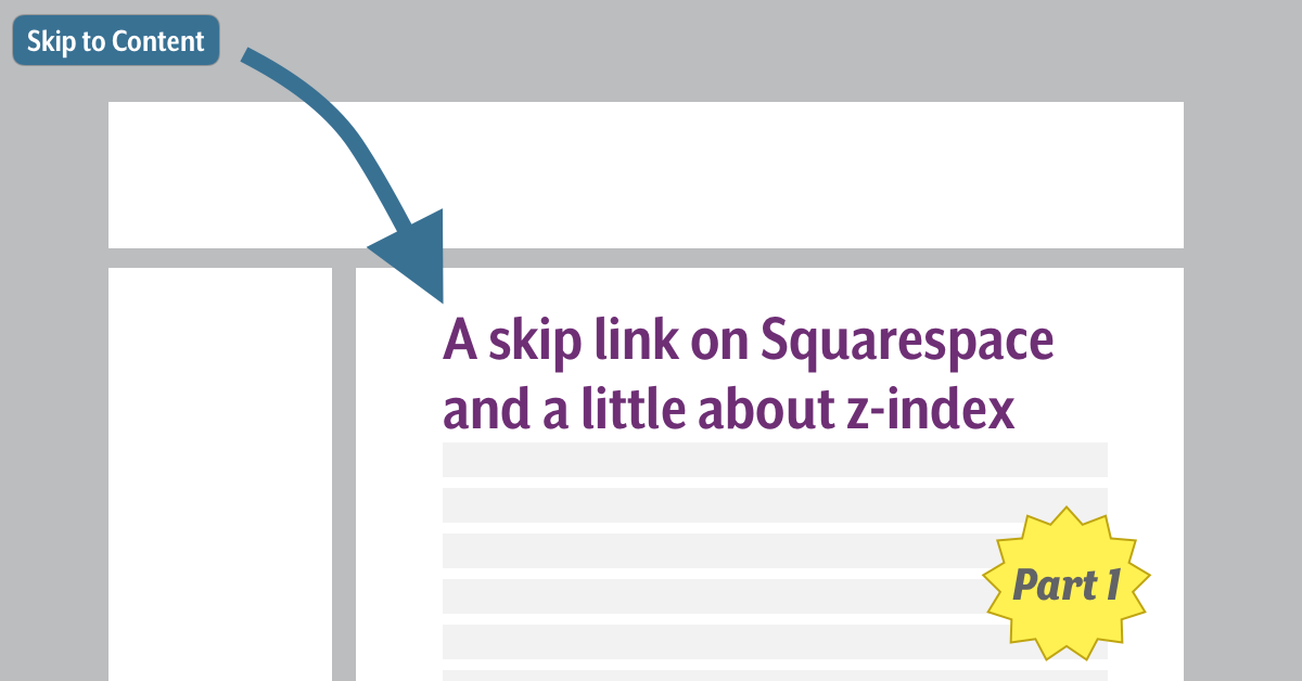
One feature that we wanted to implement on the site was a “skip link”, or “skip navigation” link. A skip link help users using the keyboard to navigate the page to skip to the main content of a page.
We found out that we needed to add a workaround to incorporate a skip link which was not available through the Squarespace template. During the course of figuring out how to incorporate the “skip” link, I ended up doing a lot of research on z-index. I learned some very interesting things about it and how it can impact usability and accessibility.
In this and the following post, I will share the method we used to incorporate a skip link into the site and what I discovered about z-index. The most significant lesson for our team here was less about Accessible Rich Internet Applications (ARIA), the Web Content Accessibility Guidelines (WCAG), or coding, and more about how one works to improve accessibility given a complex web of real world constraints.
Squarespace
Squarespace uses a collection of standard building blocks that are assembled to create a website (e.g. image blocks, text blocks, footer block). You could think of it like a modular website. Depending on the pricing tiers users have varying degrees of control over the scripting and markup on the site.
It is a great tool for people without website-building skills as it enables users to create good looking websites without coding knowledge. But, it is easy to imagine how this environment can produce sites that favor sighted and mouse users and neglect users that rely on assistive technology or have a disability.
Squarespace sites are typically built from a template. Users then add the modular content, called blocks. Thus, Squarespace users depend on Squarespace to create an accessible design and write accessible code to present the content. Unfortunately, we found that the templates often do not meet many accessibility requirements outlined by WCAG and within the lower tiered plans there is little opportunity to create content outside of the modules.
The Skip Link
A skip link is a link at the top of a web page (i.e. first in the tab order) that allows a user to bypass all the links that precede the main content on the page, e.g. navigation links. Typically, a skip link is hidden until it receives focus, and will be hidden again when focus is removed from the link. Skip links are useful for users that do not rely on a mouse to navigate a web page. For example, a keyboard user who relies on the tab key to navigate through a page’s interactive elements might need to go through an extensive number of links before landing on the main content of a page. By using a skip link, these users can bypass these links and immediately enter the main content of the site, just as a mouse user can simply click into the main content. To see the skip link on this page, simply reload the page and hit the tab key and it will jump out. For more info on skip links and how you may implement them in a web page, read Nicolas Steenhout’s blog post “Skip links are important”.
Adding the HTML to the Squarespace template
Our client’s Squarespace site relied on “text blocks” to present much of the content, and we had no way to inject the correct HTML into the content within this type of block. Squarespace does provide a “markdown block” which we used to inject our custom HTML into the site.

We moved the main heading for each page from the text block to a markdown block, put it in an <h1> element and gave it an id attribute of main-h1. We could not place the skip link at the beginning of the <html>, before the navigation links or header, as we could not directly edit the code at that place. It is created automatically by Squarespace.
We put the skip link anchor in the markdown block with the <h1>. This meant that the skip link was not the first link in the page’s tab order. To fix this we gave the link the tabindex value of 1. Rearranging the natural tab-order is generally frowned upon but we felt this was one of those exceptions where it is useful and justified. With a tabindex of 1, our skip link was now the first link in the tab order and would be the first link that a user encountered when visiting the page.
With the anchor for the skip link positioned first in the tab order, we only had to give it an href attribute that linked it to the id of the main heading, and also a class attribute so we could style the skip link correctly.
The resulting code added to the markdown block would look like this:
<a href="#main-h1" tabindex="1" class="skip">
  Skip to main content
</a>

<h1 id="main-h1">
  Main Title
</h1>
Adding the CSS to the Squarespace template
Squarespace does allow some customization of the CSS through its CSS editor, although it is not clear which elements can be affected. It does not provide a lot of detail on how the CSS in the CSS editor is applied. Their own documentation recommends that the editor only be used to change “fonts, colors, and backgrounds”. They also include a warning that other CSS changes could impact the functionality of their templates. Needless to say, our method of creating a skip link is not a Squarespace-approved method.
Because of the CSS limitations, we did not want to create an elaborate set of CSS styles, or rely extensively on the CSS. To “hide” the skip link we followed the practice of positioning the link outside of the visible area of the page. When the link receives focus, the link is moved on to the page. Using the “skip” class to target the skip link, we used the following CSS to “hide” it.
.skip {
  position: fixed;
  text-decoration: underline;
  left: -1000px;
  text-align: left;
}
To reveal the skip link, we could not just simply reposition it on the page. Because the link is part of the markdown block in the main body of the content, the skip link’s natural position would be above the main heading. The CSS needs to put the link in a spot that reflects its new position in the tab order. We needed to visually represent the tab order correctly, and since we forced the skip link to the top of the tab order we also wanted to reflect this when the link appeared on the page.
To accomplish this, we positioned the link relative to the viewport by giving it a position: fixed and putting it at the top of the viewport. In this example, I added a background color, padding and font weight to make the skip link more prominent when it appears on the page in this template. For our client blog, we centered the link to make it more prominent in their template. Each template might require some styling adjustment to make it easier to identify and read. For the sample used in this blog, I used the following CSS:
.skip:focus {
  position: fixed;
  left:0;
  top:0;

  font-weight: 500;
  background-color: #0000ff;
  color: #efefef;
  text-decoration: underline;
  padding: 5px;
}
I have created a page on Squarespace to demonstrate the skip link in action. This is just an empty template that I used to create a skip link demo, and it has no content for the moment outside of this skip link demo. I have made no adjustments to the template beside creating this skip link, so there will be many accessibility issues: Squarespace skip link demo.
Stay Tuned for Part Two
Although this solution allowed us to add a functioning skip link to the header, there are also a few drawbacks to this strategy, which I will discuss in a follow-up post.
About AIR
Since its inception in 1998, AIR has given more than 2,000 volunteers like Derek the chance to improve their knowledge of digital accessibility and inclusive design. More than 450 nonprofits, charities, schools and artists have received accessible websites and gained awareness about digital inclusion. Accessible websites allow for everyone, including people with disabilities, to access online content and become more socially and economically integrated into our digital world.
Registration for AIR 2020’s competition is now open! Web developers and designers from anywhere around the world can join!


