Following on from my look at Beaver Builder accessibility, I thought it was time to turn my attention to another page builder, Elementor.

With now over 4 million active installs on WordPress.org, and over 4,500 5-star reviews, Elementor is an incredibly popular and well-loved page builder.
But can it build accessible websites?
Elementor’s blog has a post, How to Make Your Website Accessible With Elementor, which is promising.
But the real test is checking out pages built with Elementor.
So that’s what I set out to do.
Elementor Free vs Pro
The free version of Elementor is on WordPress.org’s plugin repository.
Elementor calls its page building blocks widgets, not to be mistaken for WordPress’ native widgets.
I was surprised and pleased that Elementor’s free offering had so many widgets available. There are 30 free ones, including ones which I thought might be paid-for.
Elementor Pro boasts 52 more widgets, over 300 templates, builders for WooCommerce and popups, with 1-year support and updates.
My test setup
I used Elementor 2.8.5 and Elementor Pro 2.8.4 for my accessibility testing.
I wanted to test similar widgets to the modules I tried when I did my Beaver Builder accessibility testing.
These are the ones I tested:
- Call to Action (Pro)
- Icon (Basic)
- Icon Box (Basic)
- Icon List (Basic)
- Social Icons (Basic)
- Form (Pro) – used to build a Contact Form and a Signup Form
- Image Carousel (Basic)
- Testimonial Carousel (Basic)
- Accordion (Basic)
As you may have noticed, most of these are available in the free version of Elementor, as opposed to Beaver Builder’s equivalents.
I wanted to find examples of the widgets within templates, where possible. Templates are pre-built layouts which people can use to build sites quickly.
Elementor templates are available in the Elementor plugin or are downloadable from other third-party sites. Many are free; some require Elementor Pro.
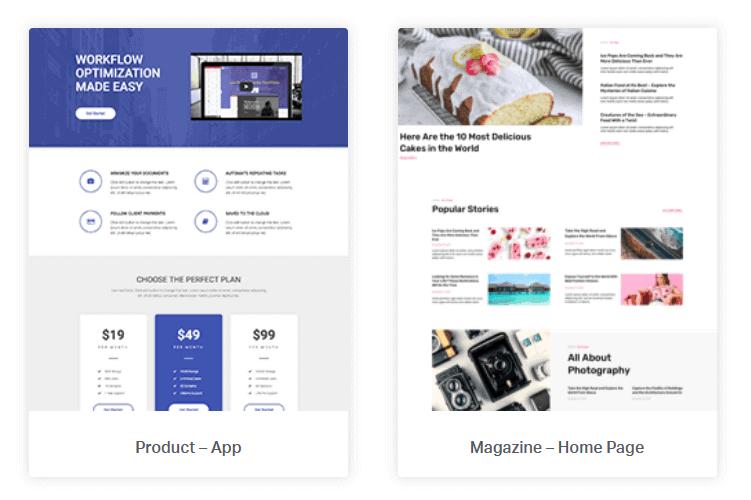

For my testing, I chose just to use Elementor’s own templates.
You can visit the Elementor Template Library to see demos of all the templates.
On my test site, I used the Astra theme, which is clean and minimal, has full width page templates and ideal is for page builders.
What things was I looking for in my tests?
In my accessibility testing the kinds of issues I wanted to test were:
- Non-text content
- Are images or icons appropriately labelled for users with sight loss?
- Are they ignored if they convey no meaning?
- Heading order
- Do headings follow a pattern that screen reader users can understand?
- Are there any missing heading levels?
- Colour contrast
- Is colour contrast on each part of the page enough to clearly make out the text?
- Keyboard operation
- Can all controls be operated by the keyboard?
- Is a keyboard-only user able to see where they are on the page when they navigate?
- Can the user pause, stop or hide moving content with the keyboard only?
Anywhere I discovered an accessibility difficulty, I looked for a way to alleviate it using Elementor’s widget controls. If that wasn’t possible, I outlined what the problem was.
Call to Action widget
The Digital Agency – Home Page template has examples of Call to Action widgets for the agency staff.


These widgets each consist of:
- Image
- Title
- Description
The code uses several <div> tags. The relevant parts are:
<div class="elementor-cta__bg elementor-bg" style="background-image: url(https://library.elementor.com/wp-content/uploads/2019/07/Team-5.png);">
</div>
<div class="elementor-cta__content">
<h2 class="elementor-cta__title elementor-cta__content-item elementor-content-item">Timothy Powell</h2>
<div class="elementor-cta__description elementor-cta__content-item elementor-content-item">Creative Director</div>
</div>
Note that the image is a background image. I’m not convinced that this is the best markup in every case. It would make sense for a decorative image, but an image in a Call to Action widget might convey something important. In that case it would be better to have an <img> tag, and the user could set the alt attribute to the image’s meaning.
There’s a Zoom In hover effect on the image by default. This could be a little distracting for someone who is motion sensitive, and I would suggest turning it off.
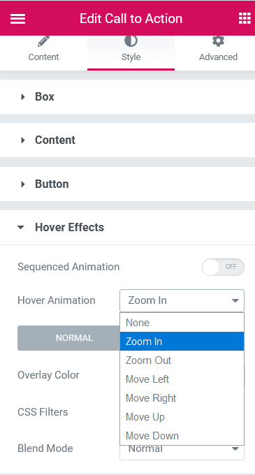
The heading is set to a level of <h2> by default.
The description – job title, in this case – is in a generic <div>.
One problem is that the staff names have too low a colour contrast against the background.
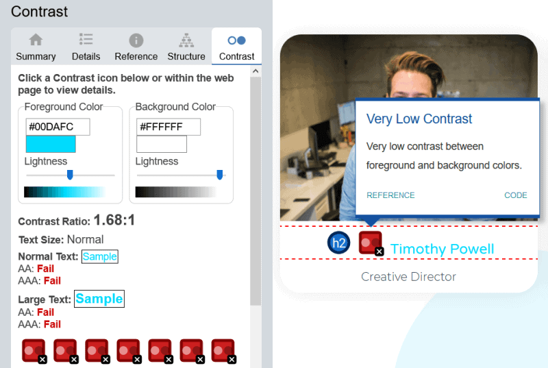
It would need to be 4.5:1 to meet WCAG 2.1 AA level.
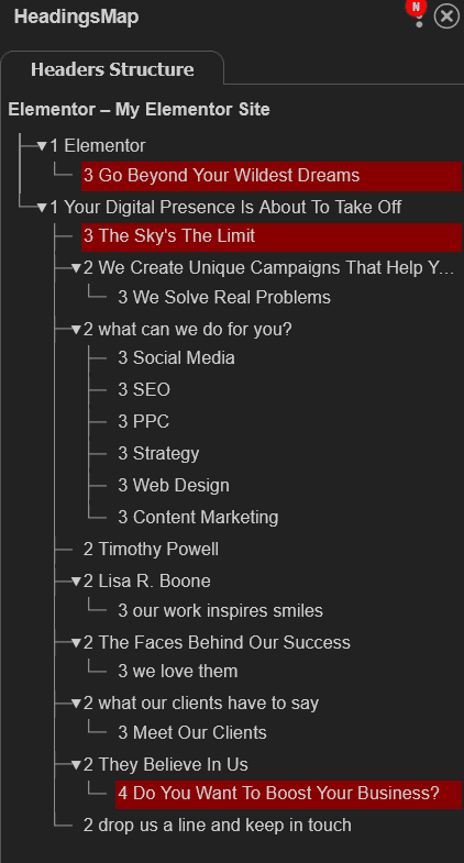
Looking at the whole page using the HeadingsMap tool, I could also spot some missing headings for the page as a whole. But the heading order for the Call To Action section is also strange.

We have:
<h2>Timothy Powell</h2>
<h2>Lisa R. Boone</h2>
<h3>our work inspires smiles</h3>
<h2>The Faces Behind Our Success</h2>
The staff names come first, before “The Faces Behind Our Success”. Also, to a screen reader user, it might seem as if “our work inspires smiles” is a subheading of “Lisa R. Boone”, which I don’t think was the intention.
It would make more sense to change the layout order and have something like this:
<h2>The Faces Behind Our Success</h2>
<p>our work inspires smiles</p>
<h3>Timothy Powell</h3>
<h3>Lisa R. Boone</h3>
This layout would make more sense on a mobile device, too, as the content in the left-hand column will always be seen first.
The good news is that we can change the layout, title and description in Elementor, using drag and drop and editing the fields.
I also changed the heading colour from #00dafc to #4632da for better contrast.
This is my revised layout, as assessed by the WAVE accessibility extension.


How Elementor handles icons
The next 4 widgets all use icons.
Elementor features an Icon Library with Font Awesome 5 icons. All the icon widgets can use this library.
Alternatively, you can add your own custom SVG icons. Normally you can’t upload SVGs to WordPress for security reasons. Elementor sanitizes your SVG files, but still warns you that there is a possible security risk.
For my icon widgets, I used the default icons that came with the templates, which are Font Awesome ones.
Font Awesome’s accessibility guidance says that there are two types of icons:
- Semantic – the icon has a meaning in itself.
- Decorative – the icon is there for embellishment only.
In either case, the aria-hidden="true" attribute should be applied to the icon, as otherwise a screen reader might read out an icon font as gobbledegook.
Icon
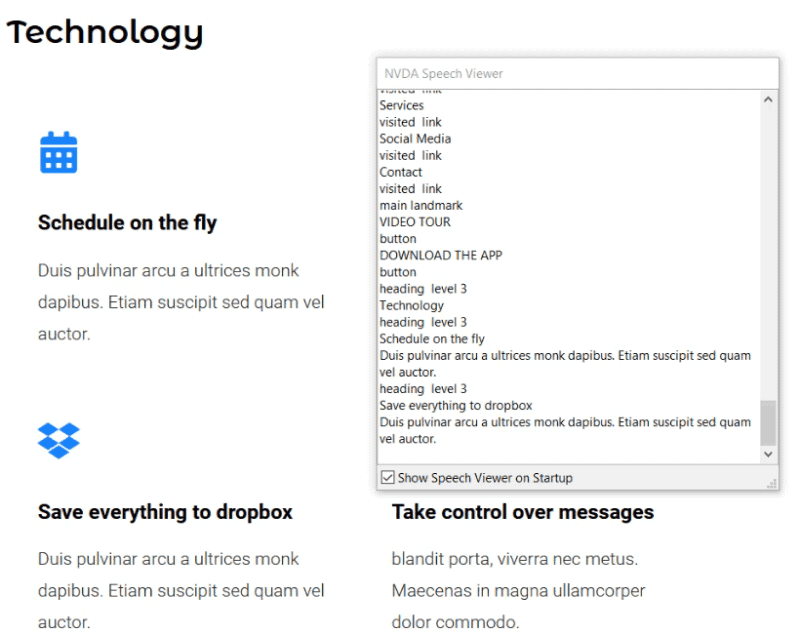
The Icon widget is used in the Homepage – App template. In this instance the icons are decorative and unlinked, so a screen reader should ignore them.
I tested with the NVDA screen reader and that is indeed what happens.
Icon Box
The Snowboard Site – Contact template uses the Icon Box for the Address, Email and Phone boxes. Each has a star icon with some contact information underneath.
![]()
![]()
Here’s the code for the Address icon box:
<div class="elementor-element elementor-element-596ac5b8 elementor-view-default elementor-position-top elementor-vertical-align-top elementor-widget elementor-widget-icon-box" data-id="596ac5b8" data-element_type="widget" data-widget_type="icon-box.default">
<div class="elementor-widget-container">
<div class="elementor-icon-box-wrapper">
<div class="elementor-icon-box-icon">
<span class="elementor-icon elementor-animation-pulse">
<i aria-hidden="true" class="fas fa-star"></i>
</span>
</div>
<div class="elementor-icon-box-content">
<h4 class="elementor-icon-box-title">
<span>Address</span>
</h4>
<p class="elementor-icon-box-description">Snow Mountain Ski Resort
16 Snow Valley Road
Snow Valley UT, 84001</p>
</div>
</div>
</div>
</div>
Icon Box accessibility
The icons have a Pulse animation effect applied to them – this could be distracting for some people, but you can turn it off as described previously.
As with the previous example, the icons are ignored by a screen reader.
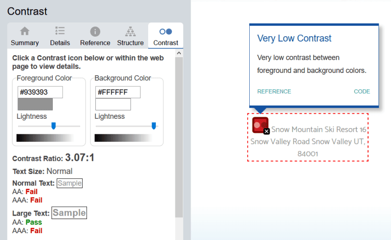
However, the colour contrast for the contact info on the background isn’t high enough.
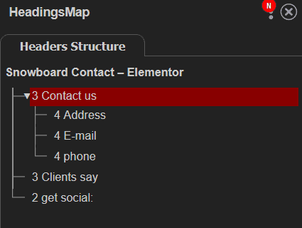
Furthermore, the heading order in the page as a whole isn’t correct. There’s no Heading 1!

Creating your own Icon Box
If you’re making your own Icon Box from scratch, there are a couple of things to watch for:
- The colour contrast on the icon and icon text needs to be stronger. You can change the colours in the widget’s Style panel.
- Check your title’s HTML tag to see that it fits with the rest of the page. The default is a Heading 3 (H3).
Using an Icon Box with a linked icon
If you want your icon to be linked, it gets more complicated, and sadly less accessible.
Making a linked icon means also linking the heading – but they are two separate links.
That means you’ve doubled the effort for a sighted keyboard user navigating the icon box. If you have, say, 10 Icon Boxes on the page, that’s 10 extra links they have to tab through.
For a NVDA user, though both links go to the same place, they are read out differently. The first one is “library.elementor.com” and the second “Elementor template library”.
[embedded content]
Ideally, you’d want both the icon and the heading wrapped in the same <a> tag.
Instead of this:
<div class="elementor-icon-box-wrapper">
<div class="elementor-icon-box-icon">
<a class="elementor-icon elementor-animation-" href="https://library.elementor.com/">
<i aria-hidden="true" class="fas fa-star"></i>
</a>
</div>
<div class="elementor-icon-box-content">
<h3 class="elementor-icon-box-title">
<a href="https://library.elementor.com/">Elementor template library</a>
</h3>
<p class="elementor-icon-box-description">The library has over 100 pre-built templates for building new websites quickly.</p>
</div>
</div>
You’d want something like this:
<div class="elementor-icon-box-wrapper">
<a href="https://library.elementor.com/">
<div class="elementor-icon-box-icon">
<i aria-hidden="true" class="fas fa-star"></i>
</div>
<h3 class="elementor-icon-box-title">
Elementor template library
</h3>
</a>
<div class="elementor-icon-box-content">
<p class="elementor-icon-box-description">The library has over 100 pre-built templates for building new websites quickly.</p>
</div>
</div>
But that isn’t possible without altering the existing HTML structure, which is the Elementor developers’ responsibility.
Icon List
Elementor’s Landing Page – Real Estate 4 template uses 3 icon list widgets for the Features section.
![]()
![]()
The icons are unlinked.
Here is the code for one of them:
<li class="elementor-icon-list-item">
<span class="elementor-icon-list-icon">
<i class="fa fa-dribbble" aria-hidden="true"></i>
</span>
<span class="elementor-icon-list-text">Back yard</span>
</li>
Again, the icons have aria-hidden="true" to hide them from screen readers.
In this instance, the icon represents the Dribbble logo, but its meaning is set in the text: Back yard.
Using a new Icon List
Here’s what a brand new Icon List widget looks like:
![]()
![]()
Watch the contrast of the light blue icons against the page background. With a white background, it’s too low (2.02:1 when it needs to be 4.5:1 or higher).
Happily, if you decide to link your list items, the link properly wraps round the icon and the list item.
Social Icons
You can find an example of the Social Icons widget on the Landing Page – Stylist template.
Here is the code for the Twitter icon:
<a class="elementor-icon elementor-social-icon elementor-social-icon-twitter elementor-repeater-item-ervv27q" target="_blank">
<span class="elementor-screen-only">Twitter</span>
<i class="fa fa-twitter"></i>
</a>
Social Icons accessibility
The good news is that each icon has a class, elementor-screen-only, which correctly identifies each icon to a screen reader user. Just the name of each social network is read out – no URLs or “link to”, thankfully.
The not so good news?
Firstly, the links don’t have a destination because the href attribute has no value. So each one opens the same page again.
Remedy this by selecting a social network and adding a URL to the Link box. Repeat for each icon.
![]()
![]()
Secondly, the target="_blank" attribute has been added to each one. That means every link opens in a new window or tab.
While some people might anticipate this, not everyone will. It’s confusing for people who expect to use the Back button, and it creates more overhead, as users have to shut down new tabs to return to where they were.
You can fix this too, but the option’s hidden: I didn’t notice it at first.
Select the cog following the Link box and it opens up two new checkboxes: Open in new window and Add nofollow. Uncheck the Open in new window checkbox.
![]()
![]()
It’s not an accessibility issue, but Mozilla’s documentation notes that when the target attribute is used on a link, rel="noreferrer noopener" should be used as well. WordPress adds this for target="_blank" links within the editor, but Elementor doesn’t.
Using a new Social Icons widget
A vanilla Social Icons widget has 3 icons – Facebook, Twitter and YouTube – in their respective brand colours.
![]()
![]()
The icons are set to open in a new window by default, so you’ll have to disable that option for better accessibility.
Form
There were two types of form I wanted to test, a contact form and a signup form for an email list, matching the forms I tested in Beaver Builder.
Contact Form
There’s an example of a contact form using the Digital Agency – Contact template.
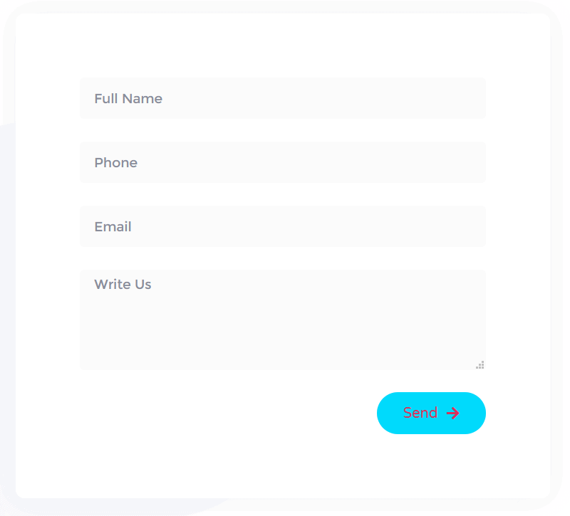

Straight away I can see this form has issues.
Firstly, the form uses placeholders, not visible labels.
Secondly, the colour contrast on the button is poor. (Strangely, the template version I tried has white text on the blue button, but either way, it’s not great.)
Thirdly, I can’t tell which of the form fields are required before I submit the form.
Contact Form accessibility
A closer inspection of the code reveals this:
There are form labels which are properly associated with their form controls, but they are hidden from sighted users with the elementor-screen-only class. For instance:
<div class="elementor-field-type-text elementor-field-group elementor-column elementor-field-group-name elementor-col-100">
<label for="form-field-name" class="elementor-field-label elementor-screen-only">Full Name</label>
<input size="1" type="text" name="form_fields[name]" id="form-field-name" class="elementor-field elementor-size-md  elementor-field-textual" placeholder="Full Name">
</div>
It would be better to make the labels available to everyone.
The required fields are divulged in the code – the phone and email fields.
<input size="1" type="tel" name="form_fields[email]" id="form-field-email" class="elementor-field elementor-size-md elementor-field-textual" placeholder="Phone" required="required" aria-required="true" pattern="[0-9()#&+*-=.]+">
<input size="1" type="email" name="form_fields[field_1]" id="form-field-field_1" class="elementor-field elementor-size-md elementor-field-textual" placeholder="Email" required="required" aria-required="true">
Both of these inputs have required and aria-required attributes. As Steve Faulkner explains in his recently updated article On HTML belts and ARIA braces, using both is unnecessary. The aria-required attribute could be ditched.
While the required fields are read out to screen reader users, everyone else will be in the dark about them until they submit the form. It would be easier to let everyone know which fields were required!
Testing the Contact Form with NVDA
Here’s a video of my test.
[embedded content]
The required form fields are read as invalid before the user has a chance to complete them. This is not an error, more a quirk of the screen reader.
If a user leaves a required field incomplete and submits the form, they get the message “Please fill in this field” for the first required field (Phone). But they have to tab to another form field and back again to see which field is invalid.
Making the Contact Form more accessible
Luckily, Elementor provides some tools to improve the form.
We can turn on the form labels.
If we click on an individual form field, we can set whether it’s required or not, and we can remove the placeholder text, which isn’t needed if we’re using labels.
To indicate to the user which fields are required there are a couple of methods.
We could turn on the required mark setting to show a red asterisk for the required fields.
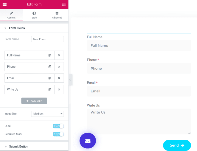

Or we could edit the labels and add the text (required) after the field name on the label. This is my preferred option.
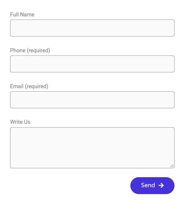
We can set darker borders on the form fields, to make them clearer.
We can improve the colour contrast on the Send button by using a darker background colour on the button.
In addition, we can customize the error messages, but only to a degree.
W3C has some suggestions about better form notifications and error handling.
Here is my revised form design. Better, but not perfect.

Are the Elementor Form widget defaults accessible?
A newly created form has the following options:
- 3 fields – Name, Email, Message
- Form labels visible
- Placeholders visible
- Email required
- Required mark invisible for form fields
- Low contrast for the form labels and the submit button – you would need to change these.
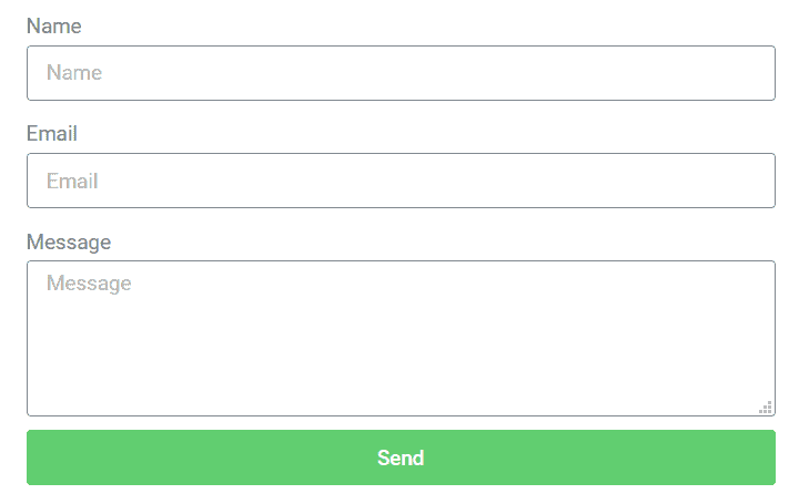

So there’s a bit of work to do to improve its accessibility.
Wouldn’t it be nice if the form was accessible by default?
Signup Form
The Maintenance Mode 4 page template has an example of an email signup form.
It has just a single field for Email.
Weirdly, this field isn’t required, so you can submit the form with no email address and get a success message!


Signup Form accessibility
To make a more accessible signup form, you should:
- Make email a required field and indicate this to the user.
- Use a visible label, not just the placeholder text.
Image Carousel
On the Digital Agency – Home Page template is an Image Carousel with logos, which contains 7 images.
Image Carousel accessibility
The problematic choices here as far as accessibility is concerned are:
- Images in the carousel auto-advance every 3 seconds. There is no control to pause, stop or hide them.
- The alt text for each image is taken from the filename. In this instance it should be the name of the brand.
(If we’re going to get really picky, the colour contrast between the logos and background is also too low!)
Testing the Image Carousel with NVDA
[embedded content]
Reading down the page with the down arrow key, NVDA doesn’t seem to read all the images, and reads out the bad alt text. It also says the graphics are clickable (they’re not).
What options does a new Image Carousel default to?
The options for a brand new Image Carousel are:
Image Carousel section
- Images selected: None
- Image Size: Thumbnail
- Slides to Show: Default
- Slides to Scroll: Default
- Image Stretch: No
- Navigation: Arrows and Dots
- Link: None
- Caption: None
Additional Options section
- Autoplay: Yes
- Pause on Hover: Yes
- Pause on Interaction: Yes
- Autoplay Speed: 5000
- Infinite Loop: Yes
- Animation Speed: 500
- Direction: Left
Making a new Image Carousel more accessible
Image carousels are just hard to make accessible, but I had a go.
I uploaded a series of images. Here are the settings I changed from the ones out of the box.
- Images selected: 8 (I added 8 images to a WordPress gallery, and made sure that each had alt text)
- Slides to Show: 6
- Slides to Scroll: 1
- Autoplay: No
When I tested with the keyboard, I found the following issues:
- Previous/next arrows were very difficult to make out due to the light grey colour (
#eeeeeeon a white background). - I couldn’t see where the focus was: that’s a big problem!
- The focus went to the bullets first, and then the previous/next controls, which is not what I expected.
Elementor uses the Swiper.js open source library for the slider, which is responsible for issues 2 and 3.
While I could try darkening the arrows with CSS and adding focus indicators (sample CSS below), trying to remediate the other issues is outwith my control.
.elementor-swiper-button {
color: #333333;
}
.elementor-swiper-button:hover,
.elementor-swiper-button:focus,
.swiper-pagination-bullet:focus {
outline: 2px solid #4632da;
}

Testimonial Carousel
The Digital Agency – Home Page template also has a testimonial carousel, with 3 slides. Each one has:
- An image
- A quote
- A name
- A title
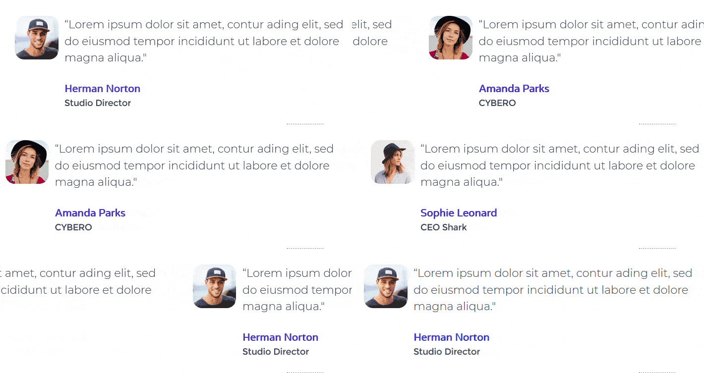

And guess what? The Swiper.js slider is used again.
Autoplay is switched on. With only 3.5 seconds between the slide transitions that’s not long enough to read the text.
There’s no form of navigation, either, so no way to advance the slides manually. You can pause them on mouse hover, but if you can’t use a mouse… too bad.
Improving the Testimonial Carousel Accessibility
There are a few things that you can do to improve the testimonial carousel.
First, turn off Autoplay.
Then, enable a form of navigation from slide to slide.
The arrows are still very hard to make out, unfortunately.
There are 3 pagination choices apart from None.
- Dots, which have the same navigation problem as with the image carousel.
- Fraction, for example, 1/3. This shows you which slide you’re on out of the total but is not a way to navigate.
- Progress, an indicator which is difficult to see and also isn’t a form of navigation.
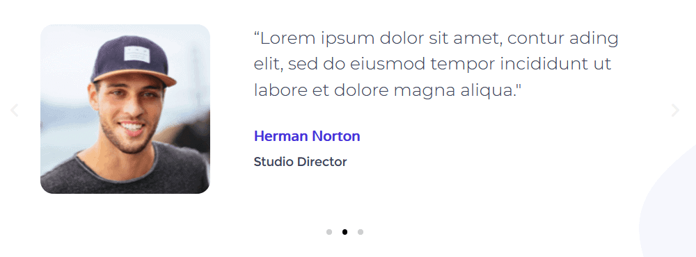

This is better, but I still don’t think it could be termed accessible.
Accordion
Elementor offers both an Accordion and a Toggle widget. Both show and hide content. The difference is that you can have multiple toggles open at one time whereas you can only have one accordion item open at a time.
Essentially the code for each is very similar.
I couldn’t find an accordion example on the templates I looked at.
There is a toggle example is on the Digital Agency – Services template.
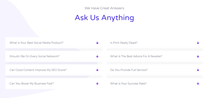

Toggle code
Each toggle item is wrapped in a <div> like this:
<div class="elementor-toggle" role="tablist">
Here is the code for one of the toggle items:
<div class="elementor-toggle-item">
<div id="elementor-tab-title-6861" class="elementor-tab-title" data-tab="1" role="tab" aria-controls="elementor-tab-content-6861">
<span class="elementor-toggle-icon elementor-toggle-icon-right" aria-hidden="true">
<span class="elementor-toggle-icon-closed"><i class="fas fa-arrow-down"></i></span>
<span class="elementor-toggle-icon-opened"><i class="elementor-toggle-icon-opened fas fa-arrow-up"></i></span>
</span>
<a href="">What is your best social media product?</a>
</div>
<div id="elementor-tab-content-6861" class="elementor-tab-content elementor-clearfix" data-tab="1" role="tabpanel" aria-labelledby="elementor-tab-title-6861" style="display: none;">
<p>Lorem ipsum dolor sit amet, consectetur adipiscing elit. Ut elit tellus, luctus nec ullamcorper mattis, pulvinar dapibus leo.</p>
</div>
</div>
Accordion code
Here’s the code for an open accordion item. It’s also wrapped in a <div> with role="tablist".
<div class="elementor-accordion-item">
<div id="elementor-tab-title-1191" class="elementor-tab-title elementor-active" data-tab="1" role="tab" aria-controls="elementor-tab-content-1191">
<span class="elementor-accordion-icon elementor-accordion-icon-left" aria-hidden="true">
<span class="elementor-accordion-icon-closed"><i class="fas fa-plus"></i></span>
<span class="elementor-accordion-icon-opened"><i class="fas fa-minus"></i></span>
</span>
<a href="">Accordion #1</a>
</div>
<div id="elementor-tab-content-1191" class="elementor-tab-content elementor-clearfix elementor-active" data-tab="1" role="tabpanel" aria-labelledby="elementor-tab-title-1191" style="display: block;">Lorem ipsum dolor sit amet, consectetur adipiscing elit. Ut elit tellus, luctus nec ullamcorper mattis, pulvinar dapibus leo.</div>
</div>
Testing the accordion with the NVDA screen reader
[embedded content]
To a screen reader, the accordion links read as tabs, which is confusing, because they don’t behave like tabs.
Nor is there anything to indicate what the links do, or that they are expandable or collapsable.
Accordion and toggle accessibility
You’ll see that Elementor’s accordion and toggle, like Beaver Builder’s accordion, use a tablist. I mentioned in a previous post why a tablist is not the ideal role for an accordion.
The accordion and toggle work fine for a sighted keyboard user. There’s a single control to open and close each one, which is good.
However, while using a screen reader, I would expect to be told if an expandable control is expanded or collapsed. This was not the case.
While Elementor’s accordion is an improvement on Beaver Builder’s, there are still better accordion design patterns available. I linked to a couple in my Beaver Builder post; Heydon Pickering’s Collapsible Sections is another.
Overall, how was Elementor accessibility?
I didn’t test all the Elementor widgets. Of the ones I tested, I found they were more accessible overall than their Beaver Builder counterparts. But there is still room for improvement.
Most of the Icon widgets are okay, but not all the options for new icon widgets are accessible ones. The Elementor team could make them more accessible out of the box.
Some widget types are just less accessible by nature; I don’t recommend using the Image Carousel or Testimonial Carousel if you want an accessible site.
A form created by the Form widget can be tweaked to be more accessible, but it still falls short of the standard needed for a screen reader regarding notifications and error messages.
I hear that Gravity Forms is making moves to make their plugin create accessible forms: when they are finished, that may be a better option for building forms.
Accordions and toggles could be improved by not marking them up as tabs and indicating the expand/collapse functions better.
Do you use Elementor? Have you noticed any accessibility issues? Let me know in the comments.
